


NMM Silver/Steel
Using:
Fortress grey
Codex grey
Wolf grey #47 (Vallejo Game color, like Spacewolf grey without the blue hue)
The steel parts were done with the same NMM techniques, over the black undercoat. I unfortunately do not have specific recipes for the various layers, and it is still a color I feel I need to improve on. Part of the problem is that there are no good dark greys out there, you should mix your own in a pot. I didn't, it took longer, and I will for my next project. Basically, re-use the gold technique, however your vermin brown equivalent should be a 50/50 mix of black and Codex grey.


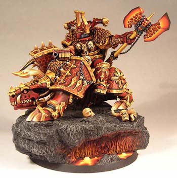
The chains were done with black basecoat, followed with 50/50 mix of codex/black, covering the entire links but avoiding where the links touch each other, to leave a line. Then a hilight of Fortress grey covering half of each link, brighter towards the light. Finally, a hilight of wolf grey on the top third of each link did the trick. As a reminder, the lava scales, where the chain crosses over, were darkened towards the base, like any other edge of the magma scales, using the colored water technique explained earlier. This helped make the chain stand out. Note that the jewelry chains were glued down to stiffen them. This became essential for the chain hanging from the axe, as otherwise, the swinging motion would break the paint as the links rubbed. To hold it in place, making it much easier to paint, very liquid superglue was applied along the chain, to fuse all the links together.
Horns and Spikes
Using:
Scorched brown
Vermin brown
Leprous brown
Bleached bone
Though the color list is very similar to the gold, in this case, bleached bone used as a brightener changes the final look considerably. Unfortunately, the step by step pictures turned out blurry, you'll have to forgive me for that. I basecoat scorched brown, then start making the spikes with vermin brown, thinned as usual. For this I'd start at the base, leaving a little ring of basecoat, and paint a spike, usually with 2 strokes from the same starting point, on stroke towards the left, one towards the right. The spikes should be rather fat at this layer. Once you've gone all around, a second layer of snakebite leather is applied. Start with more thinned down paint this time (40-50% water) and make a slightly thinner spike within the boundaries of the vermin brown spikes. 2 layers might be necessary at this point. Next, a 50/50 mix of snakebite/bleached bone layer is applied, again thinned down 40-50%, and starting the spikes even further, but keeping the with the same. Finally, pure bleached bone is applied to the last half or third of the spikes. Sometimes, when my blending wasn't nice enough, I'd go back with a very diluted paint mix of snakebite/bleached bone (75% water) and apply a little of this thinned paint on the spikes, where the transition from snakebite to bleached bone was too drastic. A few layers usually did the trick. And to complete the effect, a 80-90% water mix with scorched brown is applied in a couple layers around the base of the spike, to fade in the bone spikes into the darker browns. To top it off, like I did with every change in type of surface, blacklining the transition between horn and gold trim made it pop out and accentuated the clean look of the paintjob. Be sure to use thinned black, with the Future Floor Finish paint will tent to run along the line, making the task easier.

Skulls
Using:
Scorched brown
Bestial brown
Snakebite leather
Bleached bone

No Self-respecting Khorne Follower struts his stuff around the battlefield without skulls. I had a lot of trouble getting te skulls to look the way I liked. To this day I still feel I have a hard time with skull and bone colors, and particularly the way I paint them. So take my procedure with caution. I wanted to accentuate the shades on the skulls, and have a color that was bone, not yellowish or reddish like the spikes and horns seem to have. I found that substituting vermin brown to bestial brown from the mix actually helped make a more dry color effect for the bones. My final technique involved basecoating the skulls scorched brown, then gradually hilighting with Bestial, 50/50 mix of bestial/snakebite, snakebite, 50/50 mix with bleached bone, and finally full bleached bone. Most coats were regularly thinned, saving the heavier thinning of paint for the 50/50 and pure bleached bone coats. Doing so, I made sure to paint around the eye sockets, and the side lines on the forehead very bright to accentuate the bony features of the skulls. Another thing I found helped the look was to highlight the bone structure right over and under the teeth similar the actual teeth, but starting from a bestial/snakebite mix, instead of the darker scorched brown found in between the teeth themselves. This helps create the effect that the teeth are lodged inside the jaws, and the bone structure is only hiding the teeth that emerge. Eye sockets were kept or repainted black at the end.
Juggernaut Eyes & Gems

The gem technique is probably the only technique I mastered already before undertaking this project. Assuming you are unfamiliar with it, here are my pointers, using the Juggernaut's eyes as example. Starting with black undercoat, the lower half is painted in a slightly crescent shaped coat of scab red, thinned normally. Then, the lower third is repainted with a layer of red gore, this time thinned 50%. You might need to coats for the color to show, but for now keep going to get all the colors in. The bottom quarter is then given a heavily thinned coat of blood red, always in a crescent shape that should reach the half point on each side. And even thinner line of blazing orange is applied, thinned of course, and finally a single line of yellow is applied, though thinned normally, to show a little more with one coat.
Now is the time to go back, using the marvel of having all relevant paint on your palette should be quick. With 60-75% thinned down paint mix, reapply thin lines of colors where you feel the transition is not smooth enough. As the paint is very thin, not much will change, but a layer or two should be enough to blend in the colors without creating a new paint line with the paint you just added. After all, that additional line should be transparent a bit, as it's supposed to blend in the colors underneath. In the case of the eyes, you'll notice that I actually did this whole procedure at a tilted angle. I stated the lower half for the sake of keeping the explanation simple, but you should probably consider painting the highlight at an angle too, because the light source is rarely directly over the gem. The final, revealing touch, is made with a little pure skull white dot at the top of the gem. In my case, I made a slightly oval dot with a smaller white dot right underneath it, mimicking multiple light sources.
A few final pointers on the subject. Keep the paint thin, as you'll likely paint and repaint the area until the color transition pleases you. If you don't you'll quickly get a chalky texture, which messes any effect up. I find that deeper-looking gems fool the eye better. A deeper gem should keep black present all round the white dot; no hint of color should be touching the white dot. The color brightening should also start slowly and then brighten faster and faster as you get to the bottom of the gem. In my case, red was dominant, but red turned yellow quickly on the lower quarter crescent.
Miscellaneous Champion Details
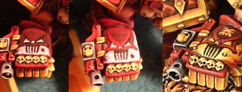
The rider being a focal point for the viewer, I knew I had to go further and add details. The helmet faceplate was slightly plain. After a careful wet layering job of red on it, using multiple watered down layers like the rest of the red armor, I decided to add visor slits. As it was too late to carve out the slits, I decided to fool the eye. A carefully painted a black spike, and directly facing the helmet, made a mirror copy on the other cheek. Then, a careful thin line, on the side opposite to the light source was painted, with a blood red/15% skull white, the brightest red I used. You must make sure to keep the width of the black slit and the highlight next to it constant. I suggest you paint the hilight and simply go back with black to make the transition line drastic and very straight. A thin wash of red ink is then applied, to make sure the highlight is kept with the same red hue as the rest of the armor.
The back of the Helmet panels was also subject to fool the eye. Though the front side of those ears has god trim, the back doesn. I didn'T feel like doing NMM gold all over, and I didn't feel like sculpting trims once more, so I decided to paint it as though there were a gold trim. I started with teh magma pattern, then made a black line fairly wide but very straight next to the magma. I then went through the regular NMM procedure. At the end I made sure to add rim highlights, very thin bright lines to make the trim look like it has depth.

The flesh arms were done with a slightly different approach. I basecoated dark flesh, then added scorched brown for shadows, normally thinned. Then, for the hilights, I used 50% thinned dwarf flesh,, followed by a 50/50 mix of dwarf flesh/bronzed flesh, and finally a thinned pure bronzed flesh layer. It made for a tanned, more contrasted flesh color, which I thought suited the hardened fighter.

The red cape was done with the same red armor colors, keeping the paint very thin to help the layering process. To give the ragged cape the impression that is was worn down and burnt, I shaded it black. I did so with a dozen or so applications of black-tinted water mix, first layer being widespread, and the last ones only applied at the very tip. A word of advice here: protect the rest of your model on open-ended features like the cape. I didn't and tiny black water droplets were unfortunately splashed all over the Juggernaut's right leg. I had to spend 2 hours touching it up...
The Axe
The axe blade I decided to keep within the magma theme and paint scales, similar to the juggernaut armor. This time however, I wanted the effect to look more like a hot piece of molten lava, held at the core with scales, and then stretching into blades, cooling down towards the edges. Just like the magma scales, I started with scab red, then painted the veins with blood red, then orange, then yellow. I kept the veins wider this time around, to show off more lava heat. I then hilighted the scales s entire surface (aside from a thin dark red border), but that didn't look quite right. I then decided that brighter yellow was required, and thus I added Light Yellow. The picture below shows the left side with my first attempt, and teh right side with my revisited concept. The scales were covered with scab red again, and hilighted to blood red on only the borders of each scales facing a top light source. I however kept a thin line of scab red showing, as a form of darklining around the scales, making them stand out better. The light yellow was only used at the intersection of some of the veins, as the heat isn't necessarily constant through the surface, and this intermittent pattern accentuates the magma pattern.

The scales stop where the axe blade starts getting thinner towards the edge. To help plan the blending job, I applied a line of each color parallel to the blade edge, darker as you go outwards. I didn't worry about blending the colors in at this stage. With this matrix I could then work on blending the colors in-between, with 50/50 paint/water mixes, diluting being crucial here to keep the final result smooth and flat. The colors, from the magma scales are: Light yellow, golden yellow, blazing orange, blood red, red gore, scab red, 50/50 scab red/black, and pure chaos black on the very edge of the blades. This is another fine example of where using a palette really helps. With all necessary colors out, you can mix various concentrations of intermediate colors, add water and paint on the axe. If you're quick and looking for an additional challenge, you can try pure blending. This happens when you put a layer of thinned color, say orange, and then next to it you apply a thinned layer of blood red/orange, actually touching the orange line. When both lines are sufficiently wet, the colors will blend in together, you'll see them mix together,, so at opposite ends the color is pure orange or blood red, , and as you move towards the interface of those 2 lines, some orange has made it's way into the orange, gradually turning the color over. You can help the blend by putting you paintbrush in there and blend in the two lines a little. The more skilled with this you are, the fewer intermediate blending layers you need to make a full color transition. I heard of artists blending red to black with simply red and black.
Though I had some success with this, but most of my work was made with wet layering and some blending (about 10-15 successive color lines, very thin). Simpler procedure, but very time consuming. My first blade (excluding scales!) took me 3 hours to get to that result. The entire axe head took about 20 hours total. Yes I am slow, but the results are good, and I'm getting quicker with each hour spent practicing. If you want to get better, you have to invest yourself in it. So once this was done, scales hilighted, a colored water wash was layered towards the chains, to darken the area and again, make the chain features stand out.
The Fur
Using:
Scorched brown
Vermin brown
Leprous brown
Bleached bone
The colors for the fur are teh same as for the horns. My best results came with a basecoat of scorched brown, drybrush of vermin brown, followed with a drybrush of leprous brown. To complete the effect, I carefully applied a 50/50 mix of leprous/bleached bone, 1/3 water thinned as usual. At this stage I painted every little strand of fur, making sure to avoid the strands in the recesses and brighten the top of the folds, to show a certain wavyness in the pelt. One more thinned layer of bleached bone, again, dragged from middle of the fur strand to the very tip like I painted the red armor, to help make the layered color transition smoother.

The Powerfist Freehand
Once everything was painted, I wanted to still kick it an extra notch. Seeing a good opportunity to show the judges I could paint without borders, I decided to paint a skull feature on the fist. I started out with a few concept sketches with paper and pen, and once I had my basic concept, I practiced the features of the skull. I decided I should draw it a bunch of times, always the same way, to get proportions rightly repeated every time. The eyebrows were drawn first, then the cheekbones, teeth, and finally the sides of the skull. That way I knew the V-shaped eyebrows had to start at this point, go up about this half the height of the total surface, and be about a third of the with of the surface. With that V for bearings, I simply added the features. I then practiced a few times on my palette, only making the black lines. Finally, time to put paint on the fist, using my practiced procedure. I blacklined the motif, then added in the reds and eventually replace the black lines with darker reds. Since a red skull on a red Powerfist won't show much, I outlined the skull with flames, from orange to light yellow.
For a final touch, I decided to add a Khorne symbol on the forehead. Again, on paper I practiced to get the symbol looking right, starting with an X that is wider at the base than the top, add the horizontal lines, then the vertical at the bottom, and voilà. Practiced 3 times with paint on palette, then blood red on the Powerfist. I did it again with orange, then yellow, and finally a hint of light yellow, but only towards the intersection of the lines. Of course that's more a principle that a fact, as this was getting very small. But that's the concept, anyhow.
The Rest of it
The axe shaft was basecoated leprous brown, again 2-3 thinned layers. I chose 2 lines of highest light, one on each side, and painted it light yellow. This will be later covered but serves as bearings for now. Then, at 90 degrees from the light yellow, a scorched brown line is applied (2 in all). At 45 deg. from the light yellow (halfway between yellow and scorched brown), a leprous brown line is applied (4 lines in all). Now, with 50% thinned paint, vermin brown is applied, covering just about all the scorched brown, from each side towards the leprous brown. Using your palette, apply successive mixes of leprous/vermin, 50% thinned, to blend in the color from the pure leprous to pure scorched brown. The same is done from leprous to light yellow. Finally, once happy with the color transition, correcting and re-correcting until the blend was smooth (it sure wasn't on my first try!), then here's a simply trick I learned from reading Allan C's articles. Thin down a color, in this case leprous brown, to a point where it's very thin, a bit like darkening the magma scales near the gold trims. Go easier on the thinning this time though, say 1 part paint to 7-8 parts water or so. You then apply this very thin wash over the axe shaft or other such blended surface. This will give all shades of the color the same uniform tint, and will actually help improve the overall smoothness of your blending. This technique works for any surface requiring smooth transition, try using a brighter to darker shade and glaze it over to see the results. Note that I did not use this technique for the NMM gold. That is because this leprous brown tint would spoil the light yellow which needs to be pure to keep the shining effect.

The Juggernaut's neck hoses. I got a lot of compliment for them and they are actually not that hard to pull off. After various attempts, here's what worked best. Using thinned paint, I start with a basecoat of scorched brown. Next comes a thin line of light yellow, lengthwise, only slightly thinned (20% or so), applied with the side of the bristles of the brush to avoid filling the cracks of the hose, . With the horizon line set, I used vermin brown and brushed sideways to apply under the scorched brown horizon. On the underside of the hoses, leprous brown was brushed on. Try to avoid filling in the cracks, but don't worry too much about it. Over the horizon line, a 50/50 mix of leprous/light yellow, followed by a leprous brown layer, at the very top of the hose. Finally, to help define each coil, brown ink was applied, thinned 75% water (and Future Floor Finish as always). A few applications should have the ink set in all the crevices without darkening the yellow skyline; touch it up if it does.
Painting the Lava Base
Using:
Chaos black
Codex grey
Fortress grey
Wolf grey #47 (Vallejo Game color, like Spacewolf grey without the blue hue)
Scab red
Red gore
Blood red
Blazing orange
Golden yellow
Light yellow #010
Skull white
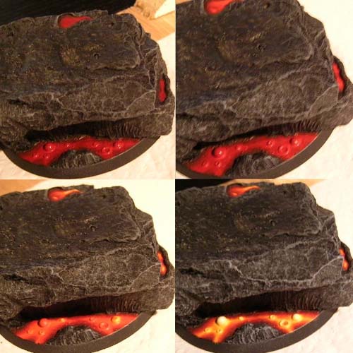
First off, once the base was basecoated black, I drybrushed Codex grey, then Fortress grey and finally a touch of Wolf grey, emphasizing on the rocky bulges I wanted to define. Next came the lava. Using 2-3 coats each time of thinned paint (35-40% water), I applied scab red all over the untouched plastic base surface. Next came red gore, covering about 95% of the surface. At the blood red stage, I started making a pattern of warmer rivers, branching off. With blazing orange the rivers are getting warmer and the paint more concentrated in central areas. Yellow was then applied as a thin line in the center of all the river branchings, but made wider where the flow was wider or the flows met. Light yellow was then only applied at the warmer regions, where the flows met, in the center. A little bit of 50/50 skull white/water was then blended in the very center of the intersections, making pools of various sizes where the lava is at its hottest. The rings and bubbles were painted by applying thick coats of undiluted yellow around the base, to fill in the interface from bubble to plastic base, and round up the interstice. I did so instead of using Green Stuff as parts of the bubbles was pretty much inaccessible to the tools, whereas paint was simply applied on the bubble and left to sag at the base. From yellow I wet layered light yellow, and finally white on top, making sure to let each layer dry before painting the next. Since the bubbles were rising lava, or gasses trapped under lava, rising up, it was meant to be the warmest of the base, and given the most amount of white.

The base had been planned to give me an opportunity to show off some light sourcing from the lava, accentuating the hot effect. I actually added some Milliput on the vertical side of the rock within the alcove at this point and purposely made vertical lines and textures with a sculpting tool, to facilitate the lighting effect. I then basecoated the area black again, then started the effect I had practiced on a few previous models before. Here's how I did it. First I figured out where the light was coming from, which was clearly the 2 bubbles, though the lava as a whole was emitting a hue. Then I figured out which areas of the rock around the light source were directly facing said light sources. These areas would get the most light. So I started by painting the lit up zones with scab red, then red gore, making the zone smaller with each brighter layer. Scab red is painted on, but with red gore I start drybrushing with a good amount of paint a smaller zone within the scab red zone. This drybrush can and will place paint in the crevices, at this point this is alright. Next is a drybrush of the main zones with blazing orange. You'll notice that I completely skip blood red, as that particular color somehow makes the effect look too much like paint and not enough like light. With the red gore I started making 2 half circles near the bubbles, which I will bring out with a drybrush of orange. Finally, a drybrush of yellow is applied closest to the light source. In my example I may have overdone the light on the crack, but that was to make sure that the light effect would stand out even though it's cooped up in the alcove.

Once the main zone was done, a little further from the large lit up zone, I painted the same colors on little outcrops of rock, leaving black gaps in between. I found this made it look like a couple rocky outcrops have a directly exposed face to the light, hence they receive reds, oranges and yellows, even though those outcrops aren't really directly facing the light source. With all this done, I glued on a few skulls, added broken horns for flavor and painted them like previously mentioned.
Conclusion
Well, on the slight chance that you've stayed awake throughout this Tutorial, I thank you for your consideration, and hope you've leaned all I had to teach... for now. Again, I'll repeat myself. Aim high, and try hard. There's only little you can learn from painting what you've already done before. It's in challenging yourself and trying something new that you really elevate your skills. Start with an original idea, something you can physically convert in some way to make it your own. Go the extra mile on everything, and show them your model is not just a nice model, it's that one particular model. Keep touching up, seek advice, and you're sure to achieve a model you'll be very proud of. It's possible, with either a lot of skill, or a lot of dedication and hard work like me. Step up to the challenge!